Sparkline Gantt Charts: How I Simplified Project Tracking (And You Can Too)
Let’s be honest: When you’re new to project management, traditional Gantt charts are confusing. They can feel like deciphering a subway map in a foreign city. I remember my first software rollout. I spent hours color-coding tasks in Excel. My manager said, “Just give me the highlights.” That’s when I discovered SPARKLINE Gantt charts. They’re the “cheat code” for PMs who need to show progress fast.
In this post, I’ll share exactly how I use them. I will include the actual Excel formulas I’ve relied on for 20+ years in tech projects. No fluff. Just the stuff that works.
Key Takeaways
- Sparkline Gantt = Clarity: A one-cell visual that screams “Here’s where we stand!”
- Best for: Daily stand-ups, stakeholder emails, or when your boss says, “I need this in 5 minutes.”
- Pair it with: Traditional Gantt charts for deep dives (PMI’s guidelines).
- Free template: Grab mine below—it’s saved me 100+ hours.
What the Heck is a Sparkline Gantt Chart? (And Why I Swear By Them)
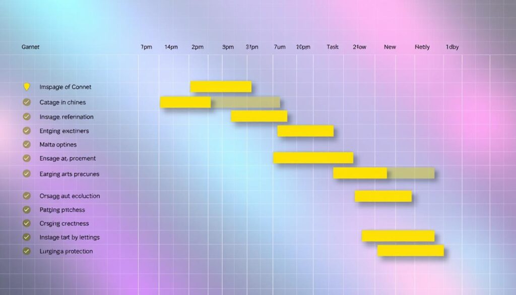
A sparkline Gantt chart is not your grandma’s project timeline. It’s a single-cell bar that shows:
- ✅ Green = Completed
- 🟡 Yellow = In-progress
- 🔴 Red = Delays
Real-life example: Back in 2015, during a messy ERP rollout, I added sparklines to Slack updates. The CTO replied, “Finally, something I can actually read.” – I still remember these words!
Why It’s Perfect for New PMs
When I transitioned from IT to PM, I wasted hours explaining timelines. Sparklines solved this by giving stakeholders instant clarity without drowning them in details.
Sparkline Gantt vs. Traditional Gantt: When to Use Each
Here are my 20+ years of PM battle scars summarized:
| Scenario | Sparkline | Traditional Gantt |
|---|---|---|
| Daily team sync | ✅ Perfect | ❌ Overkill |
| Board presentation | ✅ Hero move | ✅ Add as an appendix |
| Risk of delays | ❌ Use red flags | ✅ Dive into dependencies |
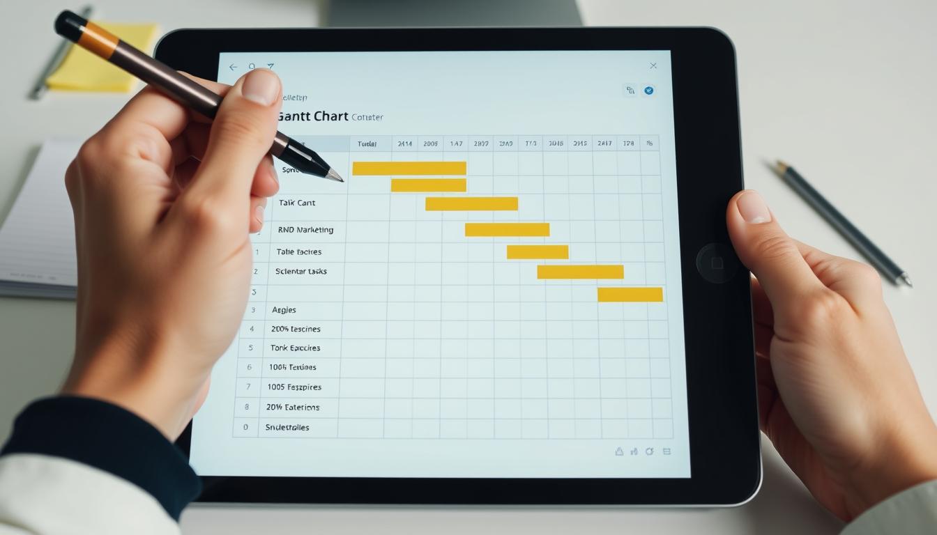
How to Build Sparkline Gantt Charts (a real example!)
Step 1: Understand the Data Structure
Before creating the Gantt chart, you need to organize your project data into a structured format. The data should include:
- Task Name : A list of tasks or activities.
- Start Date : The date when each task begins.
- End Date : The date when each task ends (or duration if applicable).
- Duration : The length of time each task takes (calculated as
End Date - Start Date).
For example:
| Task Name | Start Date | End Date | Duration |
|---|---|---|---|
| Task 1 | 2023-10-01 | 2023-10-05 | 5 |
| Task 2 | 2023-10-03 | 2023-10-08 | 6 |
| Task 3 | 2023-10-06 | 2023-10-10 | 5 |
Step 2: Create a Timeline Header
To represent the timeline visually, create a header row with dates spanning the project period.
For example:
- If your project runs from October 1 to October 10, create columns for each date:
2023-10-01,2023-10-02, …,2023-10-10.
This will serve as the x-axis for your Gantt chart.
Step 3: Use Sparklines to Represent Tasks
Now, you’ll use sparklines to show the duration of each task within the timeline.
In Google Sheets:
- Select the Cell for the Sparkline:
- In the row corresponding to each task, select the cell where you want the sparkline to appear (e.g., column E for “Task 1”).
- Insert the Sparkline Formula:
- Use the
SPARKLINEfunction. The syntax is:- =SPARKLINE(data, options)
- Example formula for “Task 1”:
- =SPARKLINE({0,0,0,1,1,1,1,1,0,0}, {“charttype”,”bar”;”color1″,”gray”;”color2″,”blue”})
- Here:
{0,0,0,1,1,1,1,1,0,0}represents the timeline. A1indicates the task is active on that date, while0means it’s inactive."charttype","bar"specifies a bar chart."color1","gray"sets the color for inactive periods."color2","blue"sets the color for active periods.
- Use the
- Automate the Sparkline Data :
- Instead of manually entering
0s and1s, use formulas to calculate the timeline dynamically. For example:- =ARRAYFORMULA(IF((TimelineDates>=StartDate)*(TimelineDates<=EndDate),1,0))
- Replace
TimelineDates,StartDate, andEndDatewith the appropriate cell references.
- Instead of manually entering
- Repeat for Each Task :
- Drag the formula down for all tasks.
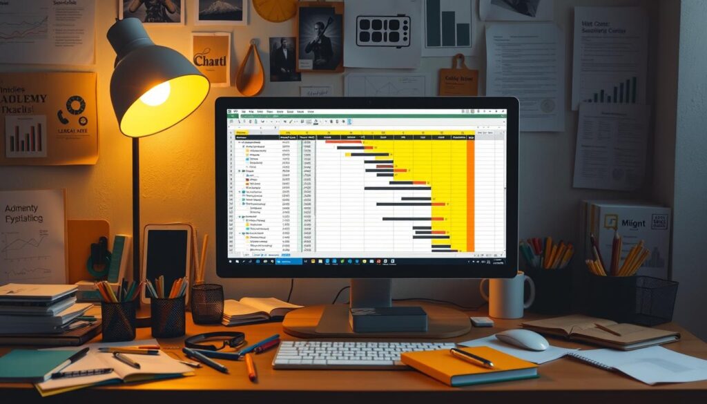
In Excel:
- Select the Cell for the Sparkline :
- Similar to Google Sheets, select the cell where you want the sparkline to appear.
- Insert the Sparkline :
- Go to the Insert tab and click on Sparklines > Bar .
- In the dialog box, specify the range of data (e.g., the timeline array) and the location (the cell where the sparkline will appear).
- Customize the Sparkline :
- Right-click the sparkline and choose Format Sparkline .
- Set the colors for active (
color2) and inactive (color1) periods.
- Automate the Data :
- Use Excel formulas to generate the timeline array dynamically. For example:
- =IF(AND(TimelineDates>=StartDate,TimelineDates<=EndDate),1,0)
- Use Excel formulas to generate the timeline array dynamically. For example:
Step 4: Format the Gantt Chart
Once the sparklines are in place, format the sheet to make it visually appealing:
- Adjust Column Widths : Ensure the timeline columns are narrow enough to resemble a continuous bar.
- Add Borders : Use borders to separate tasks and improve readability.
- Highlight Key Dates : Use conditional formatting to emphasize important milestones or deadlines.
Pro tip: Add conditional formatting to auto-color based on % complete (Microsoft’s guide).
3 Mistakes That’ll Sabotage Your Sparkline (Learn From My Blunders)
- The “Rainbow Effect”
Early on, I used 5 colors. Stick to:
- Green = Done
- Yellow = In progress
- Red = At risk
2. Forgetting Time Zones
I once showed a sparkline with mismatched dates to a London team. Always note: “All dates EST.”
3. Ignoring the Story
A sparkline is a conversation starter. Pair it with:
“We’re 2 days behind on development, but I’ve added Sarah from QA to help close the gap.”
FAQ (From Real New PMs I’ve Mentored)
“Can I use this in Google Sheets?”
Absolutely. Use =SPARKLINE with the same logic. Here’s Google’s guide.
“What if my project has 100+ tasks?”
Group them! For a recent app launch, I made 5 sparklines:
- Discovery
- Design
- Development
- QA
- Launch
Your Next Move (From Someone Who’s Been There)
Sparkline Gantt charts won’t solve every problem. They’ll make you look like an organized, proactive PM. This is the kind of PM everyone wants on their team.
Try this today:
- Download my free template (auto-colors based on % complete).
- Slap a sparkline into your next status email.
- Watch how fast people start paying attention.
If you’re still figuring out the PM mindset, my Complete Guide breaks down my transition. I moved from being a “task doer” and shifting to becoming a “leader”.